Tennessee Titans
BRIEF
From 2020 to 2022, Nash worked with the Tennessee Titans on creative projects ranging from branding, seasonal creative direction, marketing campaigns, and more. While working with the team, I made it a point to emphasize and further implement an approach to more lifestyle content compared to the traditional on-field sports only focused ways. Nash also helped a new creative regime, largely not from the Nashville area, understand what Titans fans wanted and how to market to the entire state of Tennessee.
Some of my favorite projects are presented here.
SCOPE OF WORK
Creative Direction
Art Direction
Marketing Campaign
Photo Direction
Branding
Graphics
CREDITS
Photography
Tennessee Titans
2022 Season Look & Feel
THE PROCESS
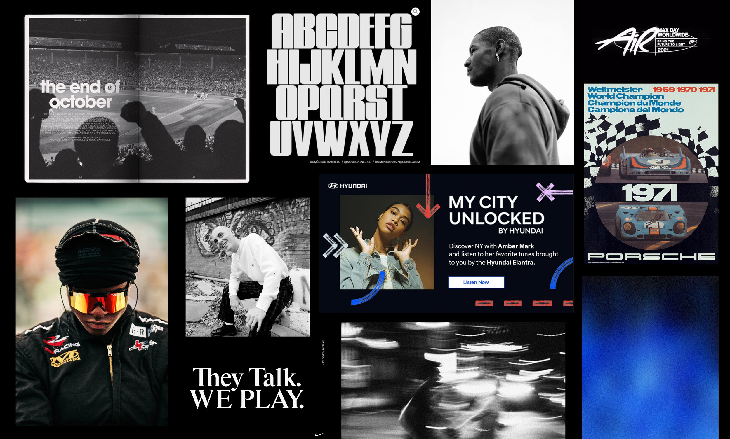
This project hit close to home for me being able to design for my hometown team in Nashville, the Tennessee Titans. I took my 10 experience from the New York City streetwear fashion industry and applied that same feeling of attitude and style to an NFL team. Of course certain ideas had to be dialed back to engage a wider audience, but overall most of my concepts made it into the final presentation. I’ve listed some key takeaways below.
KEY POINTS
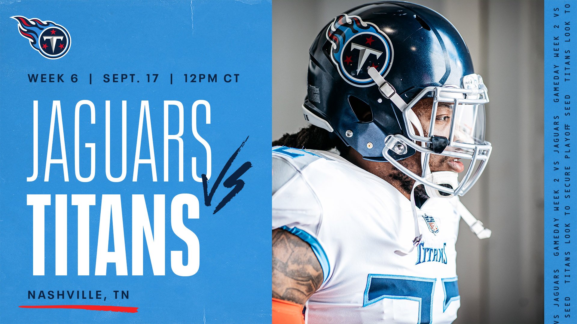
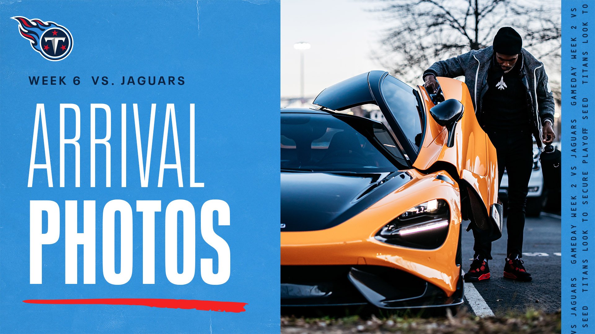
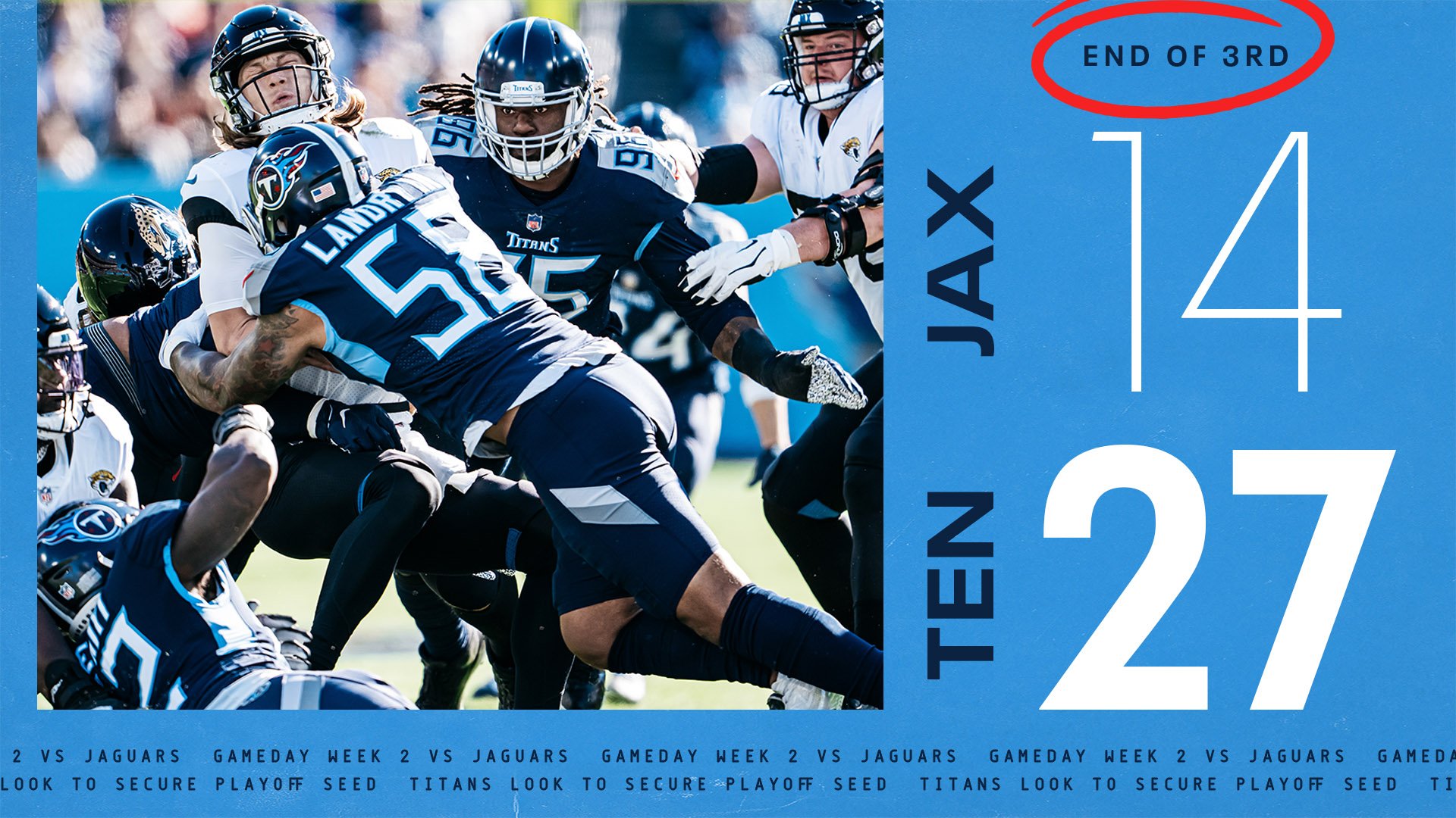
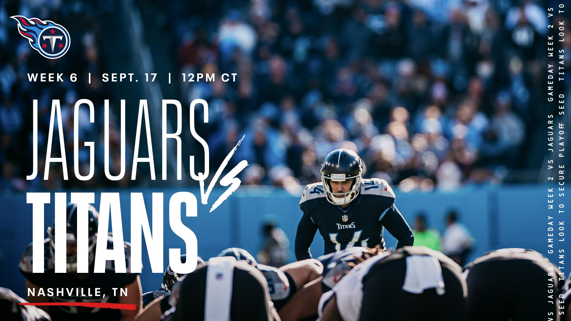
The direction focuses on strong typography using the in-house typeface Neue Plak, strong impactful photography, and subtle delineation between the Titans and their opponent. All matchup graphics feature the Titans in bold and their opponent in light weight type, where as the light blue color denotes home games and navy blue for away. There also is a subtle monospace font used aesthetically for additional information based on a News ticker.
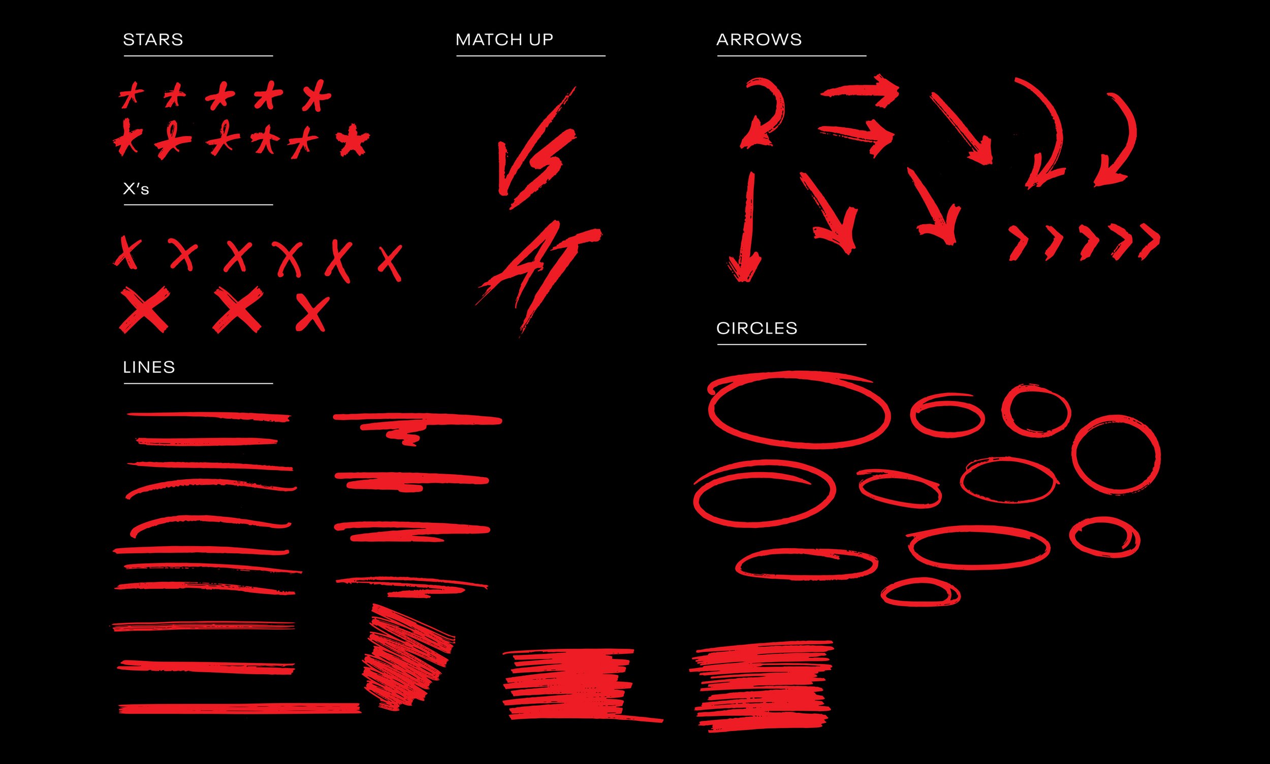
HAND DRAWN ELEMENTS
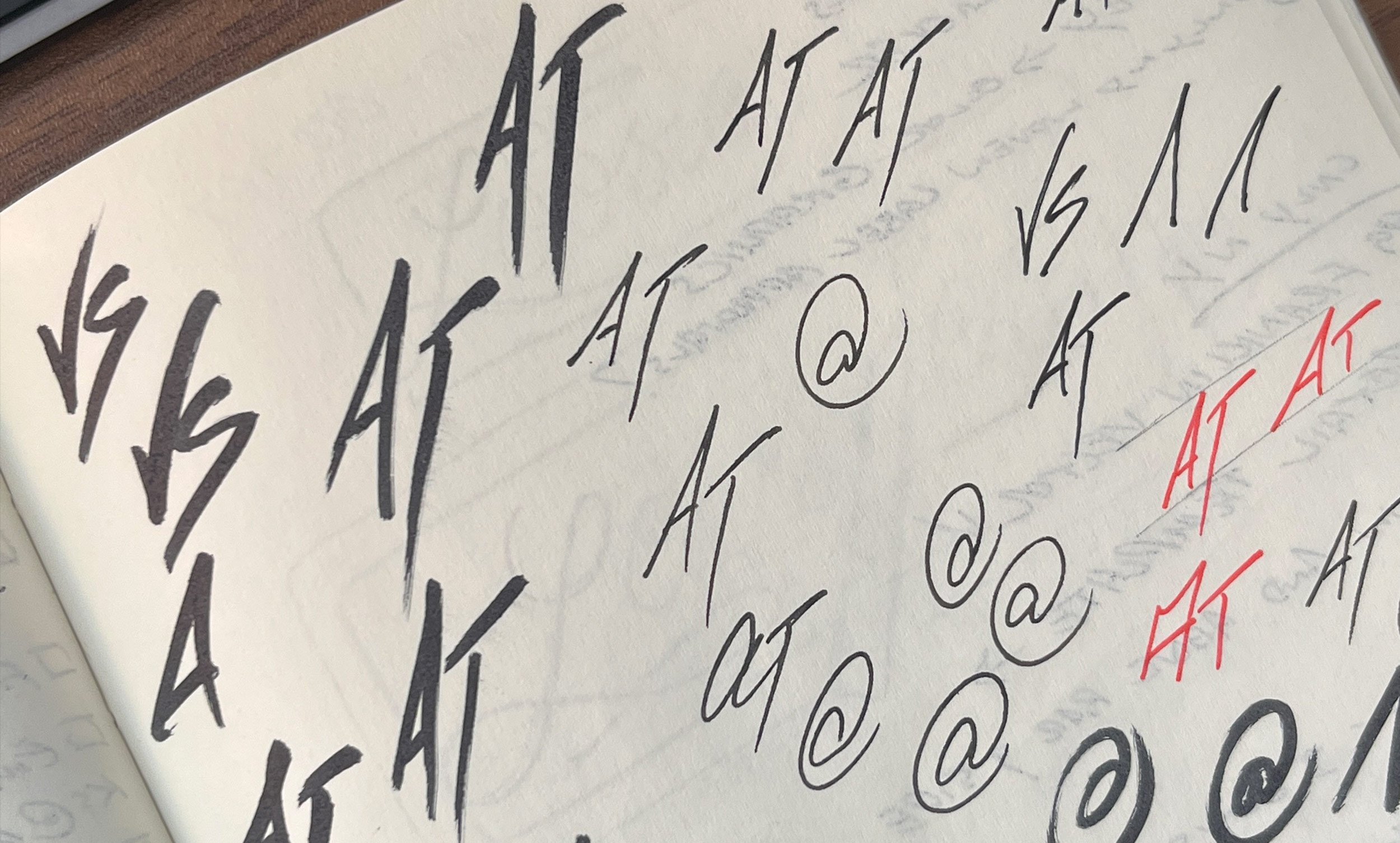
Nash pushed for and incorporated a basic hand drawn graphic system to emphasize certain phrases and add a human touch to the otherwise graphic focused creative. These almost always appeared as red, the Titans tertiary color and became so successful the team still uses and expands upon it to this day.
Original sketches shown here before scanning and vectoring.
Additional Projects & Graphics
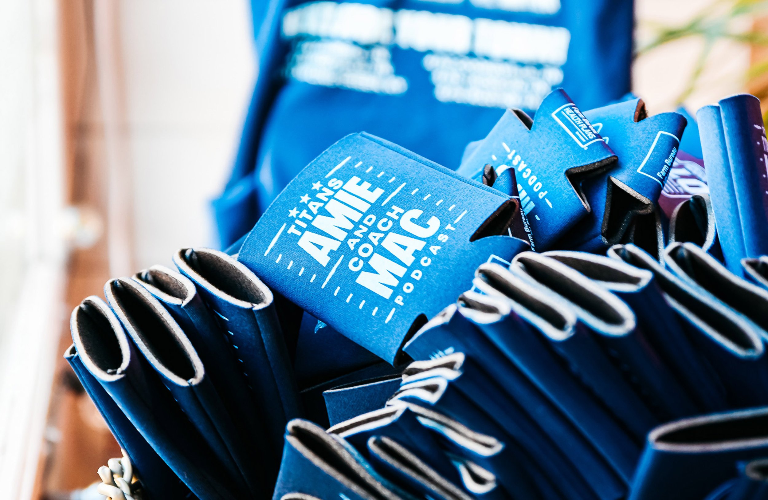
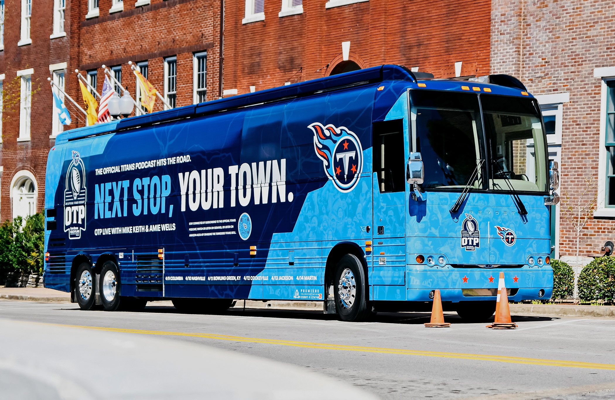
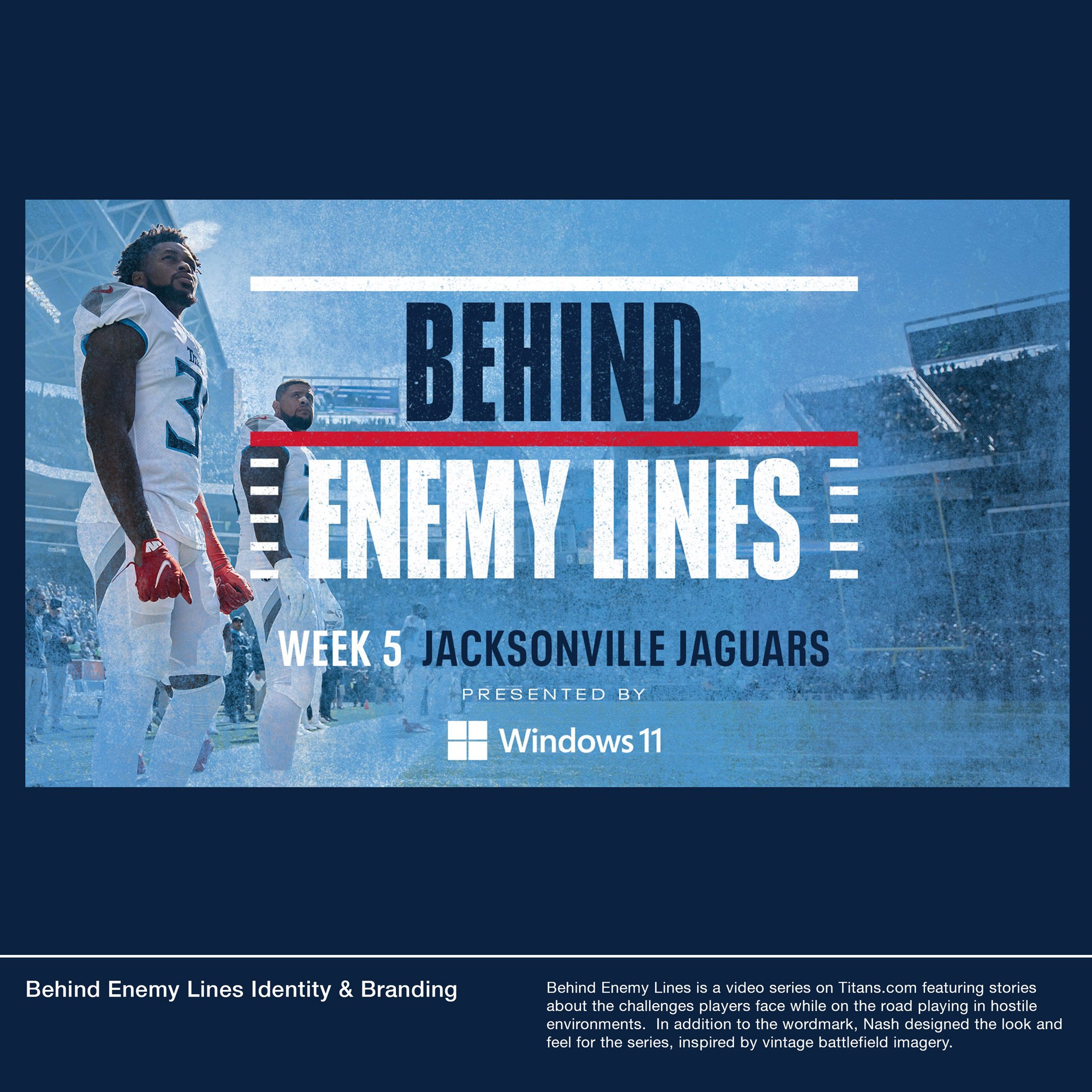
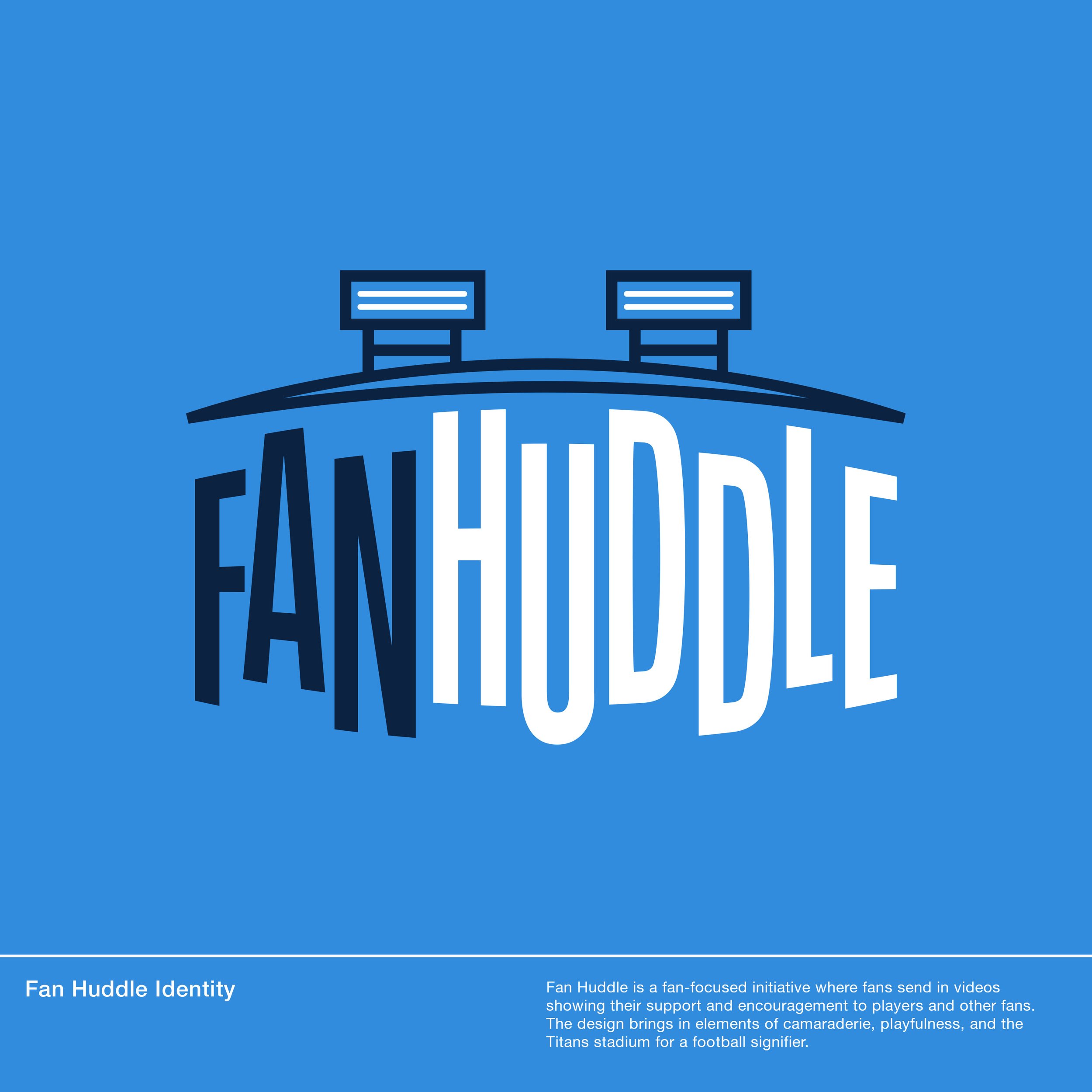
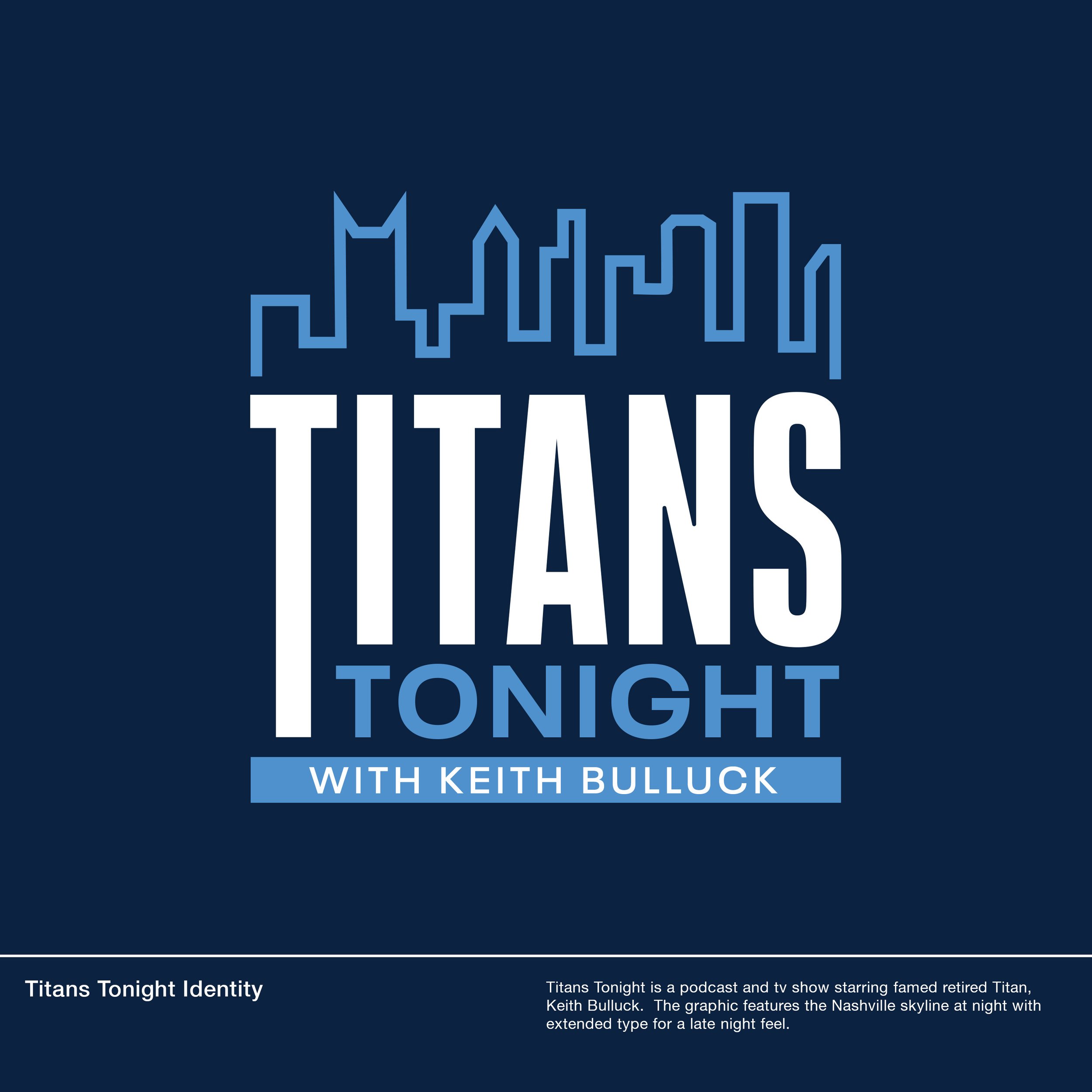
The scope of work one can undertake when working with a professional sports organization is expansive. Nash worked on executing numerous branding projects for team-centric content such as podcast branding, YouTube and social cover identity systems, physical tour bus and collateral designs, and many other in-season graphic needs that reflected the overarching season’s creative.
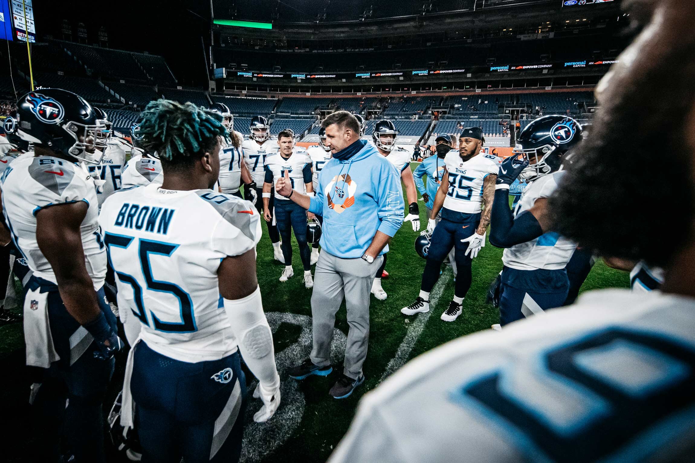
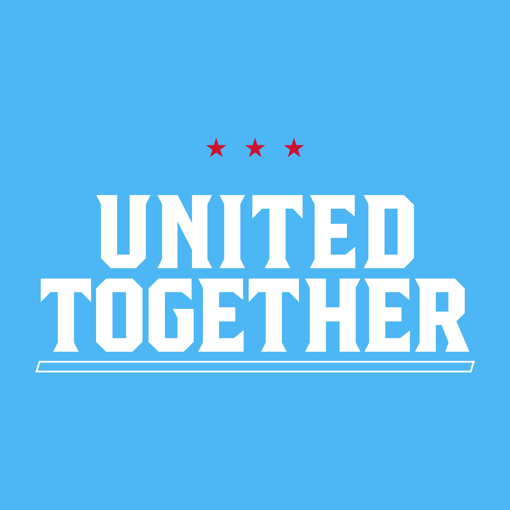
"UNITED TOGETHER” on Monday Night Football
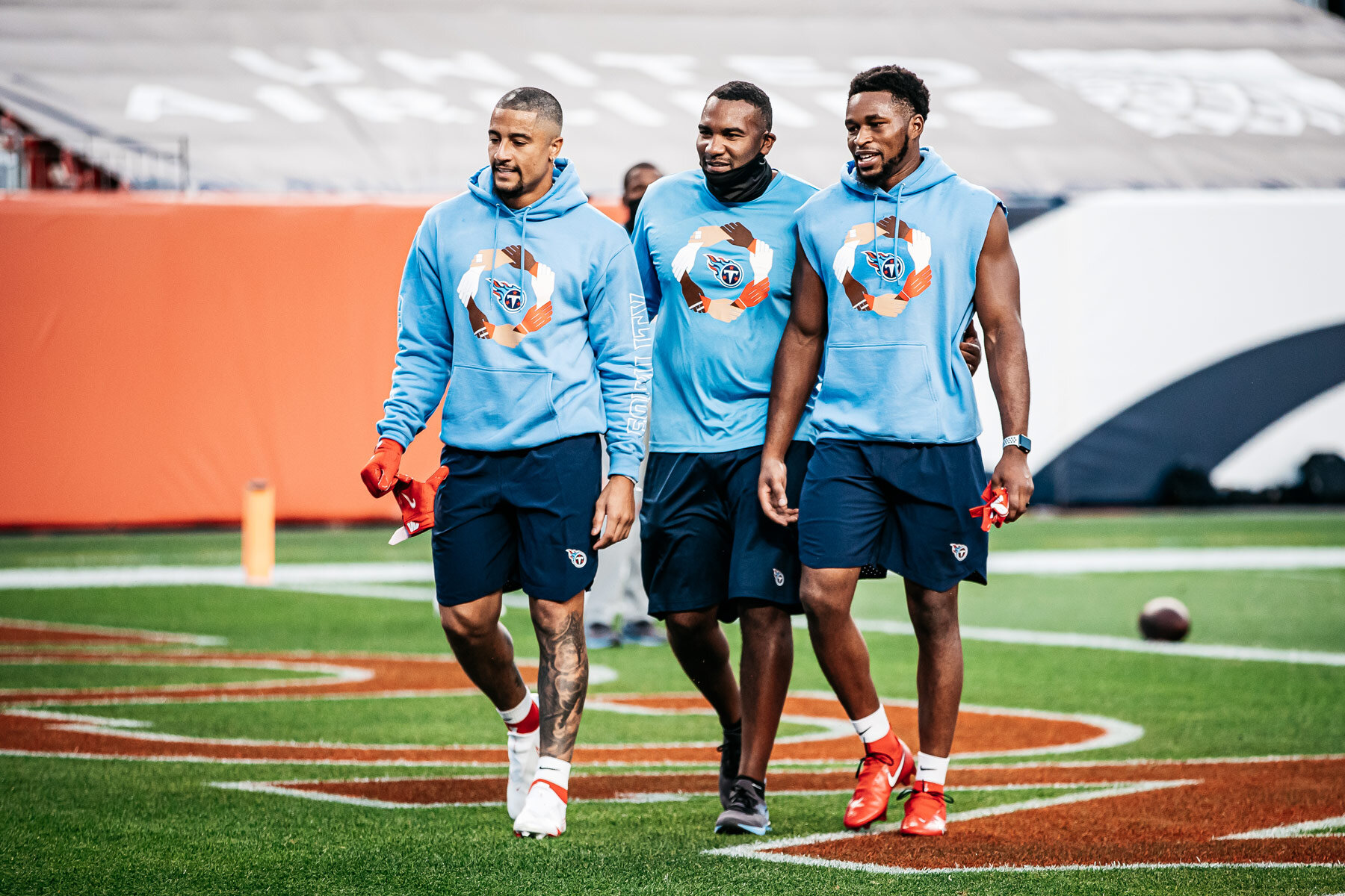
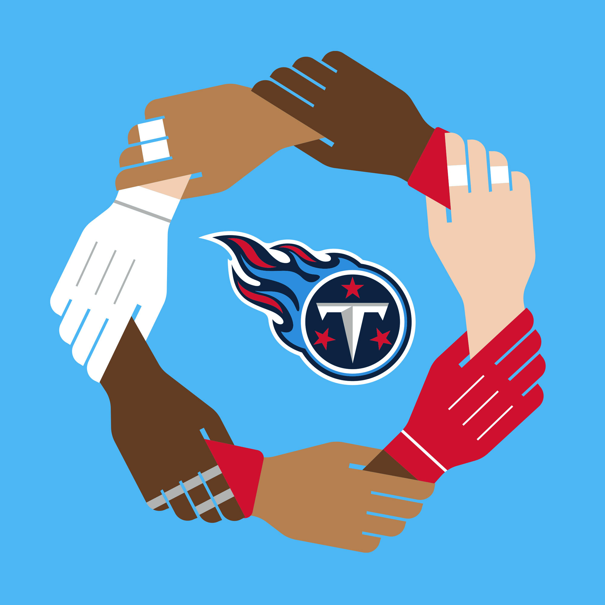
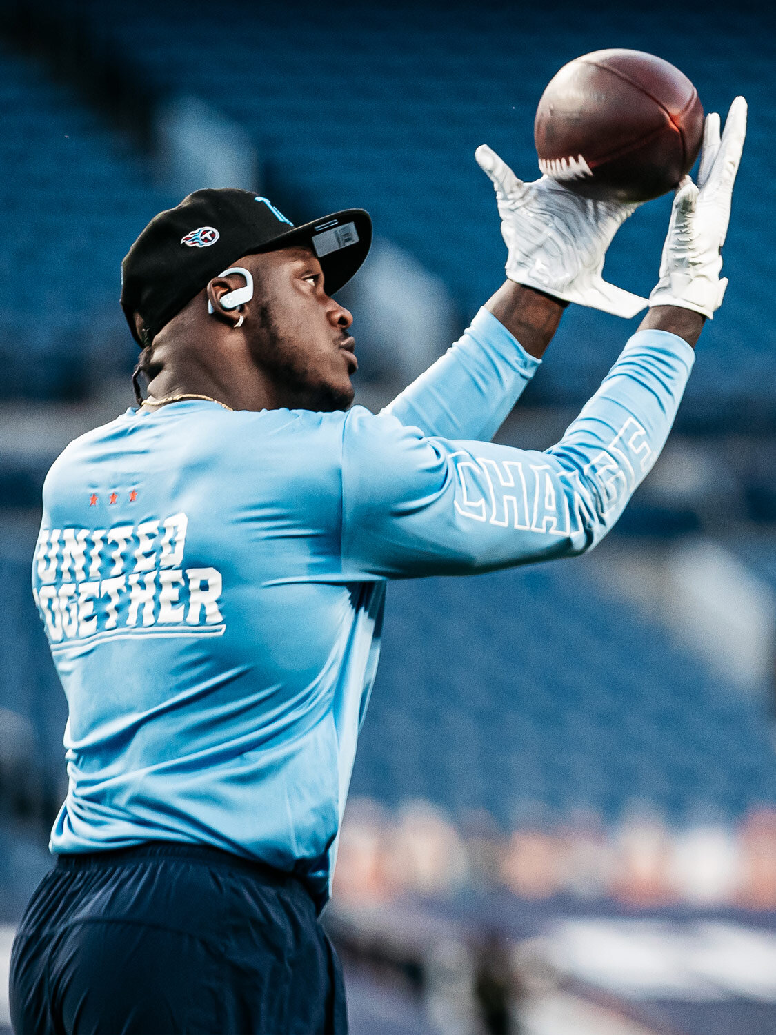
During the height of racial injustice and pandemic in 2020, I worked with the Tennessee Titans to create warm up apparel that reflected the team’s sentiment in unity. Debuting on Monday Night Football, Week 1 of the 2020 NFL season in Denver, CO.
The design builds upon the idea of unity and racial equality by illustrating player’s hands which differ greatly by the different positions and races that make up professional athletes. These hands form together to create a circle around Titans emblem, with supporting messaging along the sleeves and back.
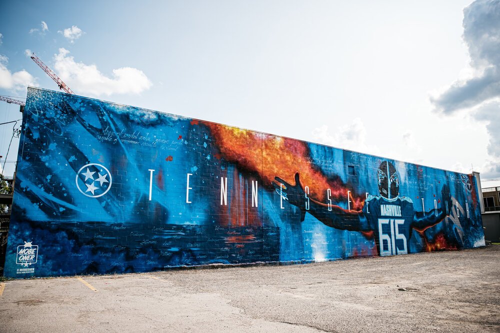
Tennessee Tough Mural
BRIEF
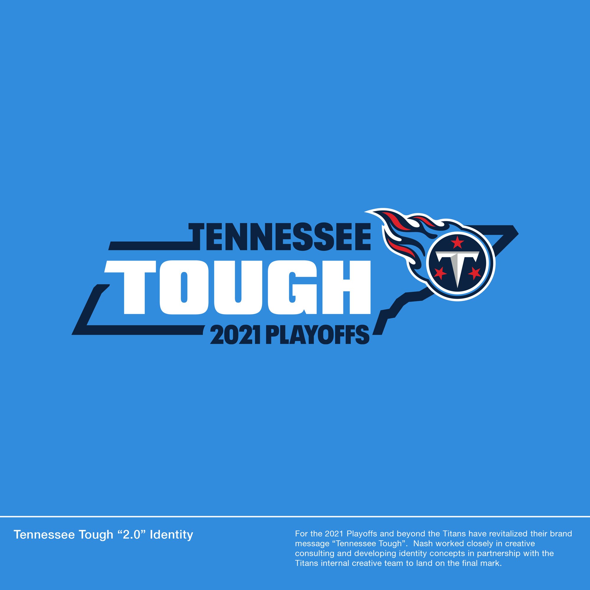
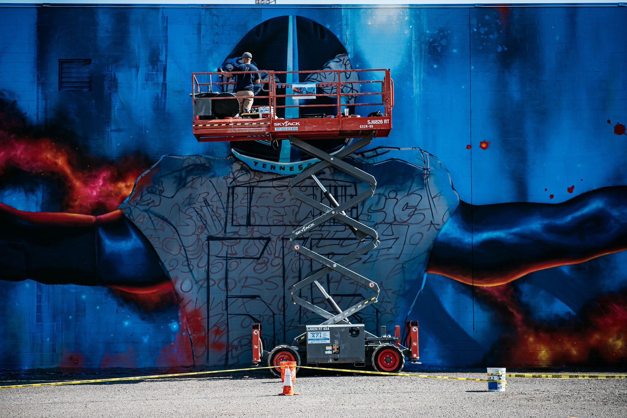
For the rollout of the “Tennessee Tough” campaign in the beginning of the 2020 season, Nash worked with then Titans Executive Creative Director, Surf Melendez, on initiatives ranging from identity concepts, marketing, and consulting for a one-of-a-kind mural in Downtown Nashville.
SCOPE OF WORK
Consulting
Marketing
CREDITS
Artist
Mobe
Photography
Tennessee Titans
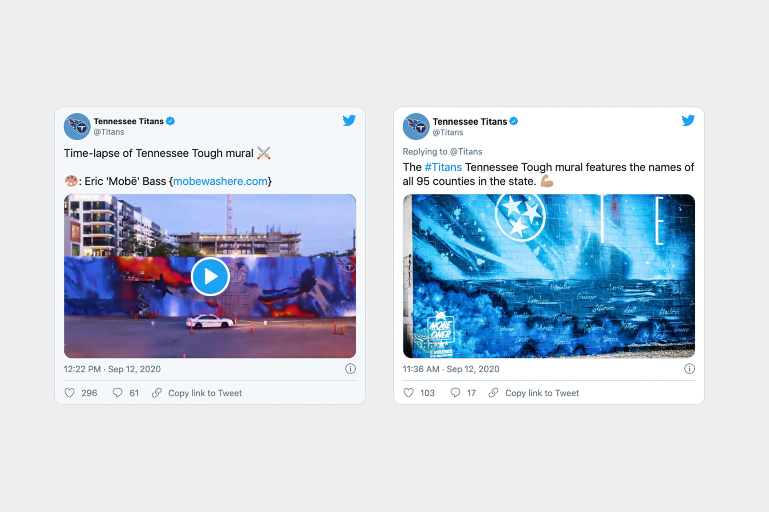
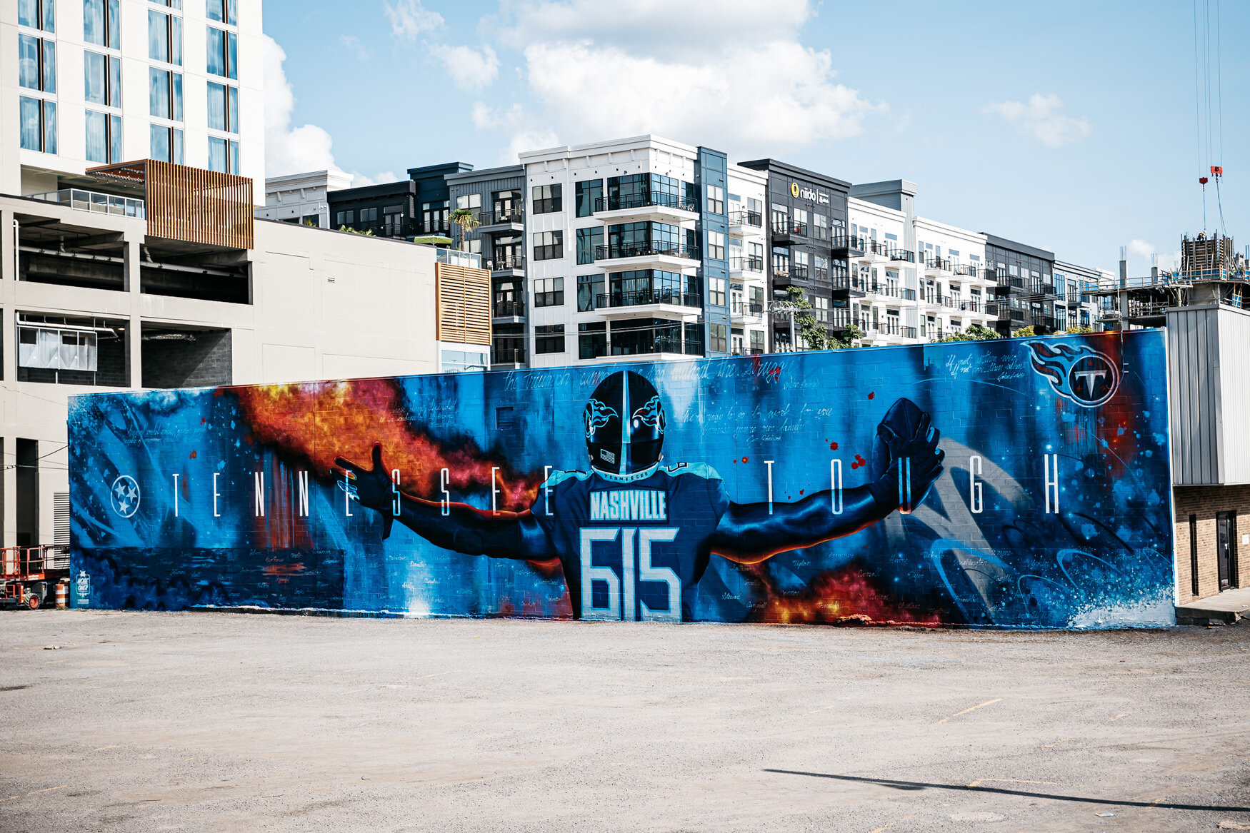
One of the key initiatives for the campaign was the idea of a unified Tennessee. Historically the Titans have garnered support in Middle Tennessee but have fell behind in West and East Tennessee. Nash suggested including all 95 of the state’s counties within the mural, promoting a visual unity for the state and showing support to fans from all corners of Tennessee.
The mural was covered extensively by local press and news outlets and even became an important backdrop during COVID-19 briefs from the Mayor of Nashville and his staff.
We’d like to thank the Titans for the role Nash played in being able to contribute to our team and home state.
